Black and White + One

9:22 PM Tuesday, October 14, 2014

1. How can I express the theme Black and White + One through photo-based artwork?

I plan to express my work in a series of photographs lined up on after another with my interpretation of the black and white plus one theme based around the idea of the mundane, ‘exactly how you expect it’, boring looking world being the black and white half of the theme and my plus one being the whimsy, like a touch of fantasy magic splashed onto the mundane of the black and white.
The concept show through cookies, having some photos taken with cookie where you would often and normally see cookie (i.e. on a plate on the kitchen counter, outside on a picnic table, etc.) but every so often there will be one photo in between. the photos I will be labelling black and white due to their boring/mundane approaches there be one photo that doesn’t seem to fit and have rather odd circumstances shown, these will the photo at immediately catch an eye just wandering along my lined up pieces; these will be my plus ones. The plus ones are the photos that seem out of place but yet still tie into the lineup. Of course they will be featuring the same cookie shown to be in the black and white photos by they will be in places one wouldn’t expect a cookie to be (i.e. each cookie taking up a seat on the subway riding off to somewhere, set up in a tiny town made of paper making them look like monster size cookies, etc.)
The lineup of photos plan to have will total up to ten but should be known that this is not a concreate number and the final number can be changed depending the current situation of the project. But the ratio between the black and white and the plus one of my photos should stay a static number of 3:1.

2. How can I explore using the medium of photography in a way that stretches my current knowledge and understanding AND suits my interpretation of the theme?


Each photo I plan to have a different type of technique in place be it in use of the camera or in Photoshop. While for my plus ones I want to use colourful and flashy techniques like that have a much more whimsical feeling like for example using the style of bokeh, lens flaring editing in extreme vibrancy. While my black and white photos on the other hand can style to be dulled coloured using a fisheye effect, selective colouring are a few to name.
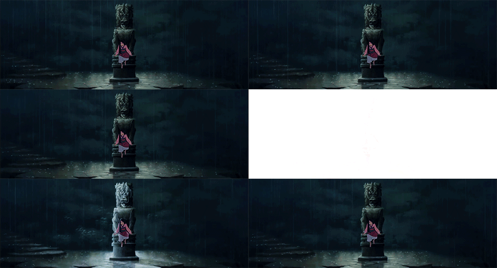
Mulan


"The flower that blooms in adversity is the most rare and beautiful of all."


the whole of the movie is a story proving oneself be it to oneself or to others against the odd. with that in mind, the two gifs that follow one another of the main character (Mulan aka the person the movie was titled after)  sitting in despair after being forced to bend to the will of the society of the time despite it going strongly against her sense of right and wrong; and it is in this part that she make a decision that causes her to break from the bend of the rule and go against it. the flower which we can see to be mulan wearing pink like the the cherry blossom flowers seen in the movie (the only flowers seen movie); and being a girl stigment she is to being a exactly like a flower, delicate, innocent and docile.

while a flower that grows against it all grows to be rough, wild and vivd. a flower that is prized for bravery.

Sense of place

9:20 AM Monday, January 27, 2014


Mine is centred around my old place of in Cabbage Town I attempt to take on a much more emotional view of having a place. I decide to play on my feeling that have developed over the years for that place that seems just to far to visit so often I have expressed them with “Rewind”. I created an interactive story book titled “Rewind” that featured a short burst of animations like components since it is still something I’m very keen on working with. 
The reasoned it was named “Rewind” is because whenever I think of old memories I think of an old cassette tape that is being rewind ready to be watched again, old movies that just punch you with nostalgia, it’s similar to the feeling I get whenever I head downtown, the glitch parts also come from this old cassette concept. Every scene in this story are actual memories of mine, no background is made up only uncoloured due to lack of memory since I know for sure many things have been painted over, the entire conversation is based on a real one I had with that very person. The only thing that had been altered is near the ending when asked what wrong with Etobicoke? Before I when I was asked that, I had no idea what to say, the real answer is said to him is still very much in the story but hidden behind glitches because I really do regret handling the question the way I did but now that more time has passed I realized the answer, and the altered ending is the result of that that realization.

Working with Flash was really fun! It really is a shame I couldn’t use Flash much more sine I overestimated the greatness of my old first gen Ipad, and the huge learning curve that Flash has. This project though was agony just because I set up a huge hurdle for myself and it resulted in taking forever to even get half way done (the total time making this from beginning to end is a little under two month) I still had fun regardless of the stress I had over this conflicting with other work and might just end up steal the laptop again when my work load dies down just to fiddle around more in Flash, I wish to make something spectacular and I assure you this, this is just a test run to make sure I’m up for the challenge.

file:///Users/309091585/Desktop/Sense%20of%20Place/Rewind.html
Copy and paste into url to view the project

haha you can't expect me to fix it from home without the files.
I'll come in on Tuesday to fix it

Amazing Inside

12:26 PM Wednesday, November 6, 2013


The poster is meant to have a simple pristine  look, using the cool matched with it partner of a neutral, colours of the school being blue and gray that surrounds the warm colours of orange that contains the information of the poster in short burst. The idea of the style is that a single line alone doesn't look to have any particular reason but putting these single lines together create our school mascot, the phoenix. The poster has a asymmetrical balance with a large image of a phoenix on the lower right in blue and gray, balanced out by the warm colour of orange in a large circle which stands out and grows against the white tinted gray background in the upper left corner. Trying to keep the poster unbiased so in theory it should attract students and parents alike.
Our school's open house goal is to show we are a welcoming community, I tried to give the feeling with the phoenix's wings spread out curving almost around the circle, looking as if to embrace it, certainly what our school wants to show.  With the smooth look of the poster with the added effect of the simplicity gives the poster a sense of professionalism,  with that hinted welcoming mixed with fierceness look that was request.
During the process of making this poster, I didn't have much experience with Ai or Photoshop and with my memory it was almost like relearning the basics and became a rather annoying hurdle to deal with on such short notice. Once finishing the poster, looking at it I am not at all satisfied with it and I find it rather disappointing to look at. I if it to be missing something, and it drives me nuts that I can place that missing feeling I also wished that I came up with a better background rather than slapping on a one solid slightly coloured background, but with time constraint, I didn't have time to learn any advance stuff when I was just getting the hang of using Ai again.

Tips and Tricks

11:39 AM Friday, October 4, 2013

Pixel Art is a type of digital art that has been used in games for year and is sadly often unappreciated, the art of carefully place a dot of colour on the computer with care and meaning, each pixel you place must have a reason in being placed there. Take my word for it, pixel art is harder then it looks sure it can be done on some of the most simplest programs such as mspaint since the only tool you'll ever use in pixel art is the pencil/pen tool and by some artist standards not even the paint bucket tool is allowed, but it can be a paint in the butt if you have no idea of the guidelines and rules that come with pixel art, especially the colour harmony that must be used to make each colour work with each other. When I tried my hand at it right off the bat like an impulse I started without even thinking about research, my first piece of pixel art turned out to be... Less then satisfactory. After the abomination of my first piece I strayed away from the style for a bit but I eventually found myself drawn to the style again but this time I looked around and found a wonderful tutorial for beginners showing some techniques on shading which I may point out can be one of the more frustrating parts of pixel art for beginners since beginners have yet to develop their own style in pixel art.

The Tutorial --> http://www.deviantart.com/art/Pixel-Art-Tutorial-Basics-196016837

The tutorial is a little on the long side but there is a lot to say about pixel art shading and outlining, yes there is a specific way to outline your art in the way of the pixel and the uses of controlled anti-aliasing rather then having it on everything like most art programs will do automatically, in pixel art you have to pick and choose where the anti-aliasing will go and even then it will only be a smudge of it. Now about the other half of the tutorial, shading, there are many ways to shade but this tutorial will show you the four basic types of shading and an added bonus of the tutorial's creator way of shading. It also shows a isometric way of shading and as well a practices shading to show how thing should go down.

After reading this tutorial my next pixel art turned out a whole lot better then the first which will never see the surface of the internet but I can show the one created after the research, but i must say is still have much to learn before I can become anything recognizable.


Sound Desgin

7:16 PM Tuesday, October 1, 2013

In sound design production, it's comprised of many layers of sound to enhance the filming production's work. Lets start off with the foley, the foley is added after filming, recorded or added separately, foley creates the everyday normal sounds we hear in our day to day lives to the sounds of the nonexistent sound of alien creatures we see in those si-fi movies. The next layer is the ambient sound also called background noise, the sound in the background be it soft rain or music to set the mood, ambient noise, it gives the production more depth and more life like, as you can imagine in real life there is always some kind of sound going on in the background like the tick of your clock or the hum of your computer's fan, they something like natural sounds. Special sound effects (SFX) is yet another layer in the art of the sound design created on the computer, the special sound effects play side by side with the foley sometimes creating completely brand new sounds off the foley by intense tweaking and pitching. Of course, one of the biggest and loudest layers of sound in film is the dialogue, the string of words the keeps the story going the people say when their mouths move, most times the dialogue is recorded after all the actions are done, simply because when the lines that are said during the shooting become so muffled by all the other noises such as the squeak of the tripod the shouts of backstage people or an airplane flying low to the ground. All these various types of sound come together in the final product to create a film that had depth and life to it, like a picture, the more shades and tones added to the picture the more realistic it'll look.

Below is one of the biggest plot developing fight in Star Wars, a fight between Obi Wan and his former apprentice Anakin Skywalker. In this section the scenes switch from place to place near the volcano. Throughout the scenes special effects sounds of the swings of the lightsabers and the sounds they creating upon contact with something. the tense music playing in the background playing up the dramatic tension is the final part of the film. Along with the grunts and shout form the characters themselves showing they are indeed having an intensive battle if you couldn't see from just them moving back and forth exchanging blows to each other, with the sound of the bubbling lava and the dramatic wind blowing. All this to draw us to be tense on the edge of our seats glued to the screen tense.


Force to do a presentation this is the link
http://prezi.com/gotvyxsx6j-a/?utm_campaign=share&utm_medium=copy&rc=ex0share